Microsoft Teams Logo

Publish content to your screens directly from Microsoft Teams

Learn More ScreenCloud Banner Arrow
ScreenCloud Close Icon
    Product

    Digital Signage

    What is Digital Signage?What is ScreenCloud?HardwareAppsProduct UpdatesSecurityDashboards

    Partnerships

    ChromeOSMicrosoft
    Solutions

    Case Studies

    Recomended case study thumbnailHow Ricoh UK Products Limited Uses ScreenCloud to Improve Efficiency and Enable a Well-Informed and Connected Workforce
    Show all case studiesScreenCloud arrow
    Pricing
    Resources
    Login
Get DemoFree Trial
PricingLogin

Digital Signage

What is Digital Signage?What is ScreenCloud?HardwareAppsProduct UpdatesSecurityDashboards

Partnerships

ChromeOSMicrosoft

Industries

ManufacturingFood & BeveragesRetailEducationHealthcareFitness, Leisure & Culture

Use Case

Employee Facing ScreensScreen Network Management

Case Studies

Recomended case study thumbnailHow Ricoh UK Products Limited Uses ScreenCloud to Improve Efficiency and Enable a Well-Informed and Connected WorkforceShow all case studies
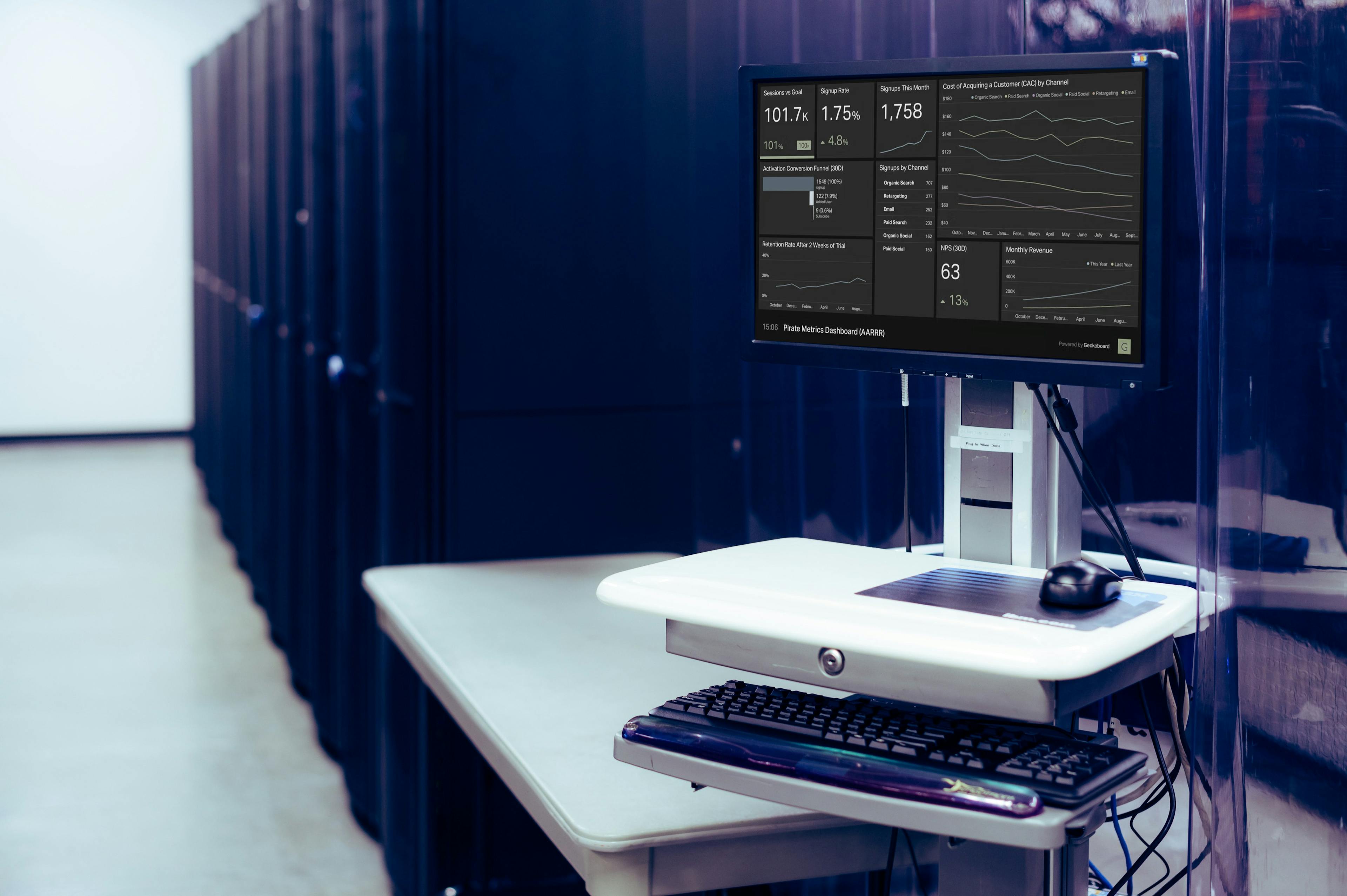
ScreenCloud arrow
Get DemoFree Trial
Resources
>

Why You Need to Create a Business Intelligence (BI) Dashboard

In this article, we will discuss the purpose of a BI dashboard, its features and components, the difference between a dashboard and a report, the benefits and limitations of BI dashboards, best practices for creating and using them, and examples and use cases for different industries and departments.

ScreenCloud Post Image

Business Intelligence (BI) is the process of collecting, storing, and analyzing data in order to make better business decisions. A BI dashboard is a visual representation of this data, allowing users to easily understand and act on key metrics and trends.

Purpose of a BI Dashboard

The primary purpose of a BI dashboard is to provide a quick and easy way to understand key business metrics and trends. This can include information on sales, revenue, customer behavior, and more. Dashboards allow users to quickly identify areas of concern, such as declining sales or customer churn, and take action to address these issues. They also allow users to track progress towards goals and make data-driven decisions.

Features and Components of BI Dashboards

BI dashboards typically include a variety of features and components, including:

  • Metrics: Dashboards display key metrics and KPIs, such as sales figures, customer retention rates, and website traffic. These metrics can be displayed in various forms, such as charts, tables, and gauges.
  • Filters: Dashboards allow users to filter data based on different criteria, such as date ranges, product lines, or customer segments. This allows users to focus on specific data and see trends or patterns.
  • Drill-down: Dashboards often include the ability to drill down into data, allowing users to see more detailed insights informing data. For example, a user might be able to click on a chart to see data for a specific product or customer.
  • Alerts: Dashboards can include alerts that notify users on the progress of key metrics or thresholds. For example, an alert might notify a user when sales drop below or above a certain level.

Difference between Dashboards and Reports

While dashboards and reports both display data, they serve different purposes. A report is typically a detailed document that provides a comprehensive overview of a specific topic or data set. It is intended for a specific audience and is often used for reporting to management or other stakeholders. 

A dashboard, on the other hand, is designed to be a quick and easy way to understand key metrics and trends. It is intended for a wide audience, including managers, team members, and other stakeholders.

Benefits of BI Dashboards

BI dashboards provide a number of benefits, including:

  • Improved decision-making: Dashboards provide quick and easy access to key metrics and trends, allowing users to make data-driven decisions with up-to-date information.
  • Increased efficiency: Dashboards allow users to quickly identify areas of concern and take action, reducing the time and effort required to analyze data.
  • Improved collaboration: Dashboards allow users to share data and collaborate on decision-making, improving communication and teamwork.

Limitations of BI Dashboards

Despite their many benefits, BI dashboards do have some limitations. These include:

  • Data quality: Dashboards can only provide accurate and meaningful insights if the data is properly handled and updated regularly. Poorly-structured or inaccurate data can lead to misleading conclusions.
  • Limited context: Dashboards typically display a limited amount of data that is most important to know at the moment. With bite-sized data snapshots, dashboards may not provide the full context needed to understand the data.
  • User error: Dashboards can be complex and difficult to use, leading to user errors or misunderstandings. However, with our Dashboard apps on our user-friendly digital signage platform, ScreenCloud aims to minimize the typical snags of displaying dashboards.

Best Practices

To ensure that a BI dashboard provides accurate and meaningful insights, there are a number of best practices that should be followed.  These include:

  • Define clear goals and KPIs: Before creating a dashboard, it is important to define clear goals and KPIs that the dashboard will help to achieve. 
  • Keep it simple: Dashboards should be simple and easy to understand. Avoid displaying too much data or using complex visualizations that can be difficult to interpret.
  • Use relevant data: Only display data that is relevant to the goals and KPIs of the dashboard. This will help to keep the dashboard focused and avoid overwhelming users with unnecessary information.
  • Test and iterate: Once a dashboard is created, it should be tested and iterated upon based on user feedback and performance. This will ensure that the dashboard is meeting its goals and is easy to use.

Examples and Use Cases

BI dashboards can be used in a variety of industries and departments. Some examples and use cases include:

  • Sales: A sales dashboard can display metrics such as sales figures, revenue, and customer behavior. This can help sales teams to identify trends and areas for improvement.
  • Marketing: A marketing dashboard can display metrics such as website traffic, conversion rates, and social media engagement. This can help marketing teams to track the performance of their campaigns and make data-driven decisions.
  • Finance: A finance dashboard can display metrics such as revenue, expenses, and profitability. This can help finance teams to track the financial performance of the company and identify areas for improvement.

Software Solutions

There are a variety of software solutions available for creating and using BI dashboards. Some popular options include:

  • Tableau: Tableau is a powerful data visualization tool that allows users to create interactive dashboards and reports. It is widely used in a variety of industries and departments.
  • Power BI: Power BI is a business intelligence tool from Microsoft that allows users to create and share interactive dashboards and reports. It is easy to use and integrates with other Microsoft products such as Excel.
  • Google Data Studio: Google Data Studio allows users to unlock the power of their data with interactive dashboards and engaging reports that inspire smarter business decisions.

Pro tip: always remember to inform your workplace by displaying your dashboards on digital signage. By using ScreenCloud Dashboards, you can securely present your Google Data Studio dashboards on screens across your company.

Conclusion

A BI dashboard is a powerful tool for collecting, storing, and analyzing data in order to make better business decisions. Dashboards provide a quick and easy way to understand key metrics and trends, allowing users to make data-driven decisions and improve efficiency. However, it's important to keep in mind the limitations of BI dashboards such as data quality, limited context, and user error. By following best practices, using relevant data, and choosing the right software solutions, businesses can ensure that their dashboards are providing accurate and meaningful insights.

About ScreenCloud

ScreenCloud helps teams in 10,000+ organizations around the world communicate with those who matter most, using the screens on their walls and the content  in their systems. 

ScreenCloud’s digital signage can inform employees on corporate information like social media feeds, data visualizations, emergency alerts, and live broadcasts – or even simply the news, sports and weather. 

Sign up for a free demo and see what your organization can achieve with digital signage.

 SC Gradient

Ready to get your organization connected?

Connect your first screen today with our 14-day free trial

Free TrialBook Demo
articles