Publish content to your screens directly from Microsoft Teams
Learn More

Playbooks
How to Create Metrics Dashboards Using Google Data Studio and ScreenCloud
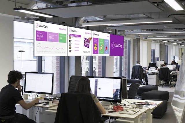
In this guide, we’ll take a look at three example dashboards you can create today using Google Data Studio and ScreenCloud. We’re using Google Data Studio because it’s free and integrates with a lot of useful tools, and we’ll use ScreenCloud to quickly and easily show these new dashboards around your office.
There are thousands of ways to communicate important information at the office – email, Slack, passive aggressive post-it notes on lunch boxes (seriously Arno, stop eating my food!).
At ScreenCloud, we’re big fans of using screens to share meaningful information. Scattered around the office are monitors displaying metrics that helps our different teams do their job and understand the business better.
Read our blog on business metrics to see how they can help your business succeed.
An added benefit of having these screens shown so prominently in the office is anyone from any team can look up at the screens and see at a glance how other departments are doing. This helps us create an environment where useful information never gets siloed. I can’t count the number of times someone’s looked up at my marketing dashboard and asked me what each peak and trough means in our traffic trend lines.
In this guide, we’ll take a look at three example dashboards you can create today using Google Data Studio and ScreenCloud. We’re using Google Data Studio because it’s free and integrates with a lot of useful tools, and we’ll use ScreenCloud to quickly and easily show these new dashboards around your office.
Digital Marketing Dashboard
If you’re a digital marketer, it’s likely you’re already using tools like Google Analytics and AdWords. Almost every Analytics and AdWords metric or dimension you can think of can be pulled into Data Studio. You can also create your own custom metrics by using simple equations in Data Studio.

In our fictional example company ‘Cloud Corp’, the marketing team wants to know how their ecommerce site is doing. The Cloud Corp Marketing Dashboard shows the number of new visitors, how many times they added products to their shopping cart, and of the new visitors how many converted into customers.
Examples of other Marketing Dashboard and metrics you can show:
- Visualize your entire buyer journey and feed each step with live data from
- Use the Map tool to show which geographies are bringing you the most visitors
- Connect to your YouTube account to show how successful your latest uploads are
Sales Dashboard
Data Studio isn’t just a tool for marketers. Data-focused Sales teams will love using it to understand the month’s targets. You can also customize your Data Studio page further with logos and static images or gifs to share sales news.
If your sales data doesn’t live in a Google tool, don’t worry. You can manually upload CSVs, use Google Sheets, or connect to a SQL database.

Apart from the online store, Cloud Corp has a small sales team that also sells widgets in a physical store. The Sales Team shows a leaderboard that’s updated every morning with the latest sales figures, as well as an image to show that month’s bonus prize.
Check out the Cloud Corp example Data Studio page and Google Sheet to see how you can add profile photos to your Sales Dashboard.
Examples of other Sales Dashboards and metrics you can show:
- Month’s revenue versus target
- Information about clients you’ve won or leads in the pipeline
- Top selling product this month
Customer Support Dashboard
Customer Support metrics are another great way to use Google Data Studio and digital signage. Having monitors with key support stats can help Support managers convey to the entire organization workload and the mood of your customers.

For our Cloud Corp example, the goal is to show everyone in the office a snapshot of Customer Happiness. If the exact numbers aren’t important, you can try using images and symbols to get the message across like in the example above, where the emojis change based on how busy the Support Team is that day.
Check out the Cloud Corp example Data Studio page and Google Sheet to see how you can change the images shown in your Support Dashboard based on equations.
Examples of Support Dashboards and metrics you can show:
- Most frequent ticket tags this week
- Ticket responses per agent
- Calls or tickets in queue
Displaying Google Data Studio dashboards using ScreenCloud
Now that we have our three dashboards, we can move onto the fun part – displaying them around the office. For this we’ll use ScreenCloud, which works with a wide range of devices and screens.
- In Data Studio, click on the ‘Share the Report’ button.
- In the ‘Share with others’ popup, click the ‘Advanced’ link
- In the ‘Share settings’ area, change who has access to “On – Anyone with the link”. This will make the dashboard accessible to ScreenCloud, but people won’t be able to find the dashboard by searching on Google.
- Now click the ‘Embed this report’ button at the top of the page (it'll look like this <> ) and copy the embed code
- Head over to ScreenCloud and login (if you don’t have ScreenCloud, you can take a 14-day free trial)
- You’ll need to have a screen already connected (see our handy guide for connecting screens)
- Head to the App Store and search for the ‘Embed App’. Click on the Embed App and then hit the ‘Add This App’ button. Paste your iframe code you copied in Step 4 into the text box, and press ‘Add App’. You can give it a name like “Sales Dashboard”, etc
- Head over to your Screens, and select your connected screen. You can add your new Dashboard to it, and it’ll automatically appear on your screen.
Voila!
Do you have metrics dashboards in your office? We’d love to see what you create and how you use ScreenCloud to share information. Send it to us at hello@screen.cloud – REMEMBER: Hide or blur out anything that’s sensitive and you don’t want others to see.
Ready to get your organization connected?
Connect your first screen today with our 14-day free trial